This is a step-by-step tutorial on how to make your first chart in BStreams. In this article, you will learn how to make one of the most familiar charts ever: the column chart.
Step 1: add a new project
If you want to make a new chart on BStreams, the first step is to click on the “Add new project” button in the MY BSTREAMS panel.
If you like, update the project title in the upper left input box.
Step 2: drag & drop your chart on the canvas
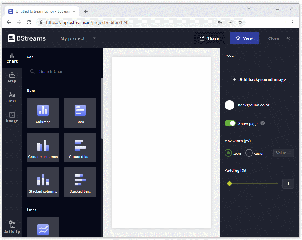
You can drag charts, maps, texts, and images from the left panel and drop them on the white canvas. You can add up to 6 elements per line.
Now drag the column chart and drop it on the central canvas.
Select the sample dataset Top 10 Richest Men in the World 2022 to start.
In the right panel, select “Name” as a dimension that corresponds to the non-numerical value and “Net worth B USD” as a quantitative measurement of data, which is the metric.
Click apply to show the result. Now, you can finally see your first chart on BStreams!
Step 3: customize your chart in the style panel
To open the style panel and customize your chart, click on the chart you’re editing.
Expand X-Axis, and turn off the Show label property to hide the label “Name” on the chart.
In the same way, hide both X and Y labels and axis.
As you can see in the following example, the chart appears cleaner and easier to read.
Finally, we need to show the columns’ values.
Expand the Data section and toggle on the Show data button. By default, values are displayed over of each column but you can move them to the top for better visibility.

Step 4: choose font, color, and set the margins of your chart
Off to creativity because it’s time to select the font, the margins, and the colors in the layout section that best suit your graph.
In the Layout section, you find a lot of properties to manage the layout of your visualization.
The Margin property allows you to define the margin around the chart area.
Move to the color section to choose how you want to color the bars of your chart. You can choose among three different ways: single color, by dimension and by metric.
Single color: select “Single color” to apply one single color. That is the default option and it is intended not to mess around with colors.
have a look to our “Top 5 data visualization mistakes” article.
By dimension: to choose the dimension of your dataset you want to color, firstly move to the Data panel. Select Country on the Dimension for colors property and then click the Apply button.
Go back to the Style panel, expand the Layout section and select Color by dimension.


Color by metric: choose the manual option and “add a segment” to emphasize specific ranges of your graph.
For example, suppose you only want to focus on the field from $107 to $129 so set it from 107 to 129. If you want your audience to focus on this segment, choose a color to highlight it. We only choose one color to highlight the elements we wanted to focus on.
Don’t color the rest of the chart if the other parts are not really relevant, so they will get the least attention.
You can also specify a label that will be shown on the legend. Fulfill the Legend label with a short description, expand the Legend section and turn on the legend.

Step 5: write a catchy headline and subtitle
To make your chart more significant, write a catchy headline and subtitle to let your audience immediately understand what your chart is about. Try it out and see if you prefer a left, center, or right alignment. You can also customize the size and the weight.
Don’t forget to cite your data source to give the data producer the proper credit!
You’re almost done, but you only miss a few steps:
- choose to display or hide the chart gridlines
- select a background to emphasize the chart within the canvas. Colors are an essential element of data visualization, it’s wise to only use colors when is necessary
- add a legend if you want to help your audience properly identify and understand data.
Conclusion
To sum up, the main four steps to make a chart in BStreams are:
- add a new project
- drag and drop your chart on the canvas
- select a dataset, metrics, and dimensions
- customize your chart in the style panel
Want to learn more about? Email us at support@bstreams.io
If you haven’t checked our blog yet, give it a look and let us know what you think about it.
Read more here