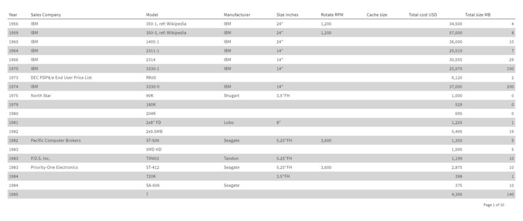
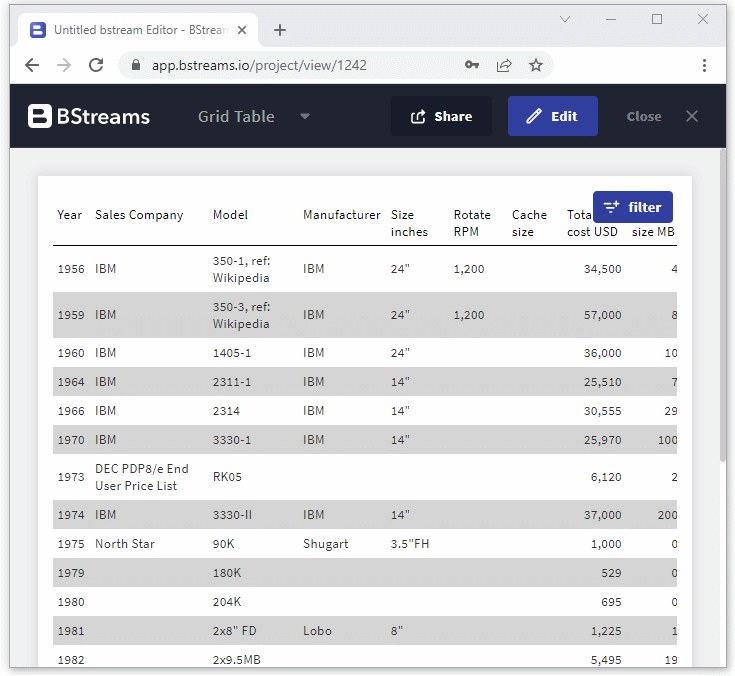
Grid tables are a common and easy-to-build data visualization organized in columns and rows. Despite other charts we’ve written about in previous articles, like bar charts , area charts , or line charts , data tables are not restricted to a specific number of dimensions or metrics; for that reason, they can be considered a versatile visualization.
Moreover, the combination of data types, words, numbers, and images all organized in grids makes communicating information easier.
They are an excellent visualization widely used in data analysis, research, and communication to keep track of information in terms of numbers, quantities, names, addresses, and many other details.
What is the difference between Grid tables and charts?
Although these two visualizations may seem interchangeable with other standard charts, there is a difference to keep in mind: the way we process data tables differs from one of the charts. In fact, while data tables deal with our verbal communication system, we basically read them by scanning rows and columns; charts deal with our visual system. That means the information within the charts is displayed in symbols such as lines, bars, columns, slices, or points.
If you want to know more about this evergreen dilemma, read this article titled Visual battle: table vs graph by Cole Nussbaumer Knaflic.
Once this difference is clear, it is now easier to understand when to choose for one visualization instead of the other.
How to design Grid tables?
Since data tables display a vast amount of data, it’s important to keep in mind some recommendations to help the audience interpret it better.
Horizontal or vertical
Given that data or grid tables can be read by scrolling across rows and down columns, a method we can adopt to help read it is to highlight rows or columns, depending on if we want our audience to read the data table vertically or horizontally. This way, for human eyes, it will be easier to scan the information.
Remove clutter
Even if borders in specific ways are helpful to separate elements, in others – mostly with heavy borders – they can make the scanning process of visualizing information challenging. That means not removing borders at all but using border lines.
Visual elements
The addition of some graphic elements like icons can be a great ally to help focus our audience’s attention on some information to communicate. Also, the strategic use of colors can help us in our intent.
How to make a Grid table in BStreams
It may be obvious to say, but the very first step is to have a dataset. Import your data by adding a new dataset or opt for the sample dataset; it’s your choice.
- Add a new project if you haven’t already opened one
- Drag the table and drop it on the canvas
- Import your data file, select a dataset or use the proposed sample dataset
- Add any dimensions and/or metrics you need
- Click apply to show the result
Remember that the sorting of the top and bottom fields (metrics and dimensions), in the DATA panel will affect the column’s position when displaying the table.
Tables often contain a huge amount of data that takes up too many rows.
To put one or more initial filters, go under the Data panel, turn on the Set filter option and add as many filters as you need.
For an initial and exhaustive exploration of your dataset, switch the “Show user filter button” and flag each field of the dataset you want to show to users. You can also allow users to filter data, a very useful feature when dealing with large datasets.
Customize your Grid table
Style panel
Most of the main options are found in the Layout menu
Show Header: switch the “show header” button on or off, depending on if you want to visualize the column’s name. By default, the button is switched on, but it’s your choice to hide the headers or not. When the column’s headers are shown, you can customize how they appear by moving to the Cols panel and modifying the single column’s Header.
Show header bottom border: switch this bottom on or off, depending on if you want to separate your column’s headers with a borderline from the rest of the information.
Parse markdown: If you write a markdown in any of your dataset fields, you can format them accordingly. Learn more about markdown syntax and usage at the following guide: https://guides.github.com/features/mastering-markdown/
Stripe table: refers to what we have written previously; that is how you want your audience to read the information within the table: horizontally or vertically. Select horizontal if you want the data table to be read by rows or vertical by columns.
Rows per page: choose how many rows to display per page. You can choose to display up to 100 rows per page.
Mobile views: on small devices, you can visualize the table as a grid or a card layout design. You can also arrange the number of rows/cards displayed on the device’s screen.
Cols panel
Move to the cols panel (columns panel) to customize the single column of the table. Click on the “Move columns” button to sort the columns within the table according to your needs.
When you’re done, click again on the button to inactive it. You can now click on the single column to expand it and manage its properties.
For example, you can change the font size, its color, or the column’s header.
Click on the Sortable button to sort interactively the column.
To highlight specific segments of cells and emphasizes unusual values, add as many segments as you need and give them a value range and a color
Want to learn more about grid tables? Email us at support@bstreams.io
If you haven’t checked our blog yet, give it a look and let us know what you think about it.
Read more here